
PROJECT OVERVIEW
The Product: Cee’s Family Restaurant is a family-owned restaurant located in a small city. Cee’s Family Restaurant strives to deliver healthy, affordable meals and side dishes. They offer a wide spectrum of competitive pricing. Cee’s Family Restaurant targets customers like commuters and workers who lack the time or ability to prepare a family dinner.
Project Duration: July 2023 - November 2023
Challenge: Design an app for a local Family Restaurant that allows users to easily order healthy and affordable meals.
Solution: Cee's Family Restaurant offers busy customers, such as commuters and workers, a convenient way to place and receive orders without sacrificing quality.
Target Audience: Cee's Family Restaurant offers busy customers, such as commuters and workers, a convenient way to place and receive orders without sacrificing quality.
Key Challenges/Constraints: Create a mobile app for a fictional gallery for audio tours. User interviews and usability studies had to be completed virtually. This project had zero budget.
My Role: UX designer designing an app for Zia’s Pizza from conception to delivery.
Responsibilities: Conducting interviews, paper and digital wireframing, low and high-fidelity prototyping in Figma, conducting usability studies, accounting for accessibility, and iterating on designs
THE PROCESS
User Research
I conducted interviews and created empathy maps to understand the needs of the users for whom I was designing. Through this research, I identified a primary user group as working adults who don't have enough time to cook meals. User research revealed that time was not the only constraint that prevented users from cooking meals at home. Other issues that users faced included their obligations, interests, or challenges that made it difficult for them to buy groceries for cooking or to go to restaurants in person.
In addition, I was able to identify three pain points that these users experience:
1. Time: Many working adults face the challenge of balancing their professional commitments, personal lives, and other activities.
2. Navigation: Text-heavy menus are often difficult to read and order from, making it more time-consuming to search for meals and place an order.
3. Payment: Complicated payment processes.
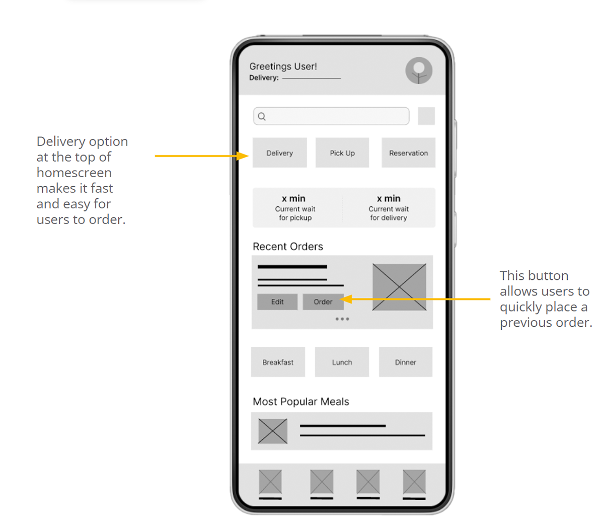
I used the information collected during interviews to create a persona named Avery. Avery is a mid-career professional with a busy schedule and wants to maintain a healthy yet delicious diet. Additionally, I developed a user journey map for Avery, which helped me identify that having a "previous orders" option would be beneficial to address Avery’s time pain points.
Problem Statement: Avery is a busy working professional with an unpredictable schedule that leaves little time for meal planning and preparation. Avery needs a quick and easy solution to order from a variety of healthy meal options so that they can spend more time pursuing hobbies and social activities.

Mapping Avery's user journey revealed how helpful it would be for users to have access to a dedicated Cee’s Restaurant app.

Paper Wireframes
To ensure that the digital wireframes of the app were well-suited to address user pain points, I took the time to draft iterations of each screen on paper. When designing the home screen, I prioritized a quick and easy ordering process to help users save time.


Digital Wireframes
During the initial design phase, I incorporated feedback from user research and peers in the Coursera course to create the wireframe screen designs.
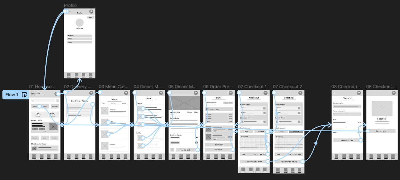
For a usability study, I created a low-fidelity prototype, using the completed set of digital wireframes, with the primary user flow being placing an order for delivery.

Usability Study Round 1
I conducted two rounds of usability studies. Findings from the first study helped guide the designs from wireframes to mockups. The second study used a high-fidelity prototype and revealed what aspects of the mockups needed refining. The primary findings in round one were:
1. Users want to order a healthy meal quickly
2. Users need more information on how they can edit their address
3. Users want an easier way to schedule an order
Usability Study Round 2
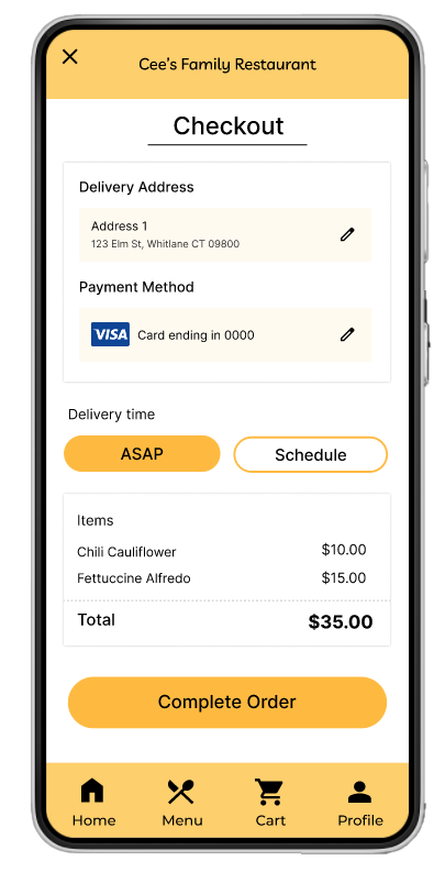
I conducted a second round of moderated, virtual usability study using a high-fidelity prototype to identify any aspects of the mockups that needed refining, improving, or changing. The findings from round two revealed that users found the checkout process to be too complicated due to the presence of too many unnecessary steps.
Mockups
Early designs allowed for limited date selection but after the usability studies, I added additional options for selecting date and time.
The second usability study revealed frustration with the checkout flow. to streamline this flow, I consolidated the “Current order” and “Checkout screens” into one “Order summary” screen. I also added the pickup or delivery option to this screen.


DELIVERABLES
Key Mockups
High Fidelity Prototype
Accessibility Concerns
TAKEAWAYS
Impact: The app makes users feel like Cee’s Restaurant thinks about how to meet their needs.
One of the comments from my peers was: "I found the app really user-friendly to navigate, and I was impressed by how easy and straightforward the ordering process was. I would definitely use this app to order a quick and healthy meal."
Lessons learned
While designing the Cee's Family Restaurant app, I gained valuable insights into features that I initially assumed would be intuitive but turned out not to be, based on user feedback. This underlines the importance of user testing to ensure that all users' needs are met because their satisfaction is very important.
Hypothetical Next Steps
1. Conduct another round of usability studies to validate whether the pain points users experienced have been effectively addressed.

